The Processing based program earthights visualises the world's light pollution in an abstract way. The data comes from an hidden image file which is read live at the current mouse position. The image file is a very popular one that shows the light pollution as a photography from space. For my purpose I photoshoped the image a bit as you can see when the program starts (scroll down for a video demonstration).
The visualization is not intended to reveal real values or to support any conclusions, it's more intended to show trends in a playful way. It's on purpose that the visualization itself is very abstract and gives no direct associations with light pollution or a world map.
Since I just used an image file, the data to use were slightly limited. For a meaningful differentiation the visualisation uses two parameters. First is the brightness of the pixel at the actual mouse position. The second is the average brightness around that pixel. The visualisation of the first parameter is done through lines that spring from the mouse position. The more bright the selected pixel the more lines are drawn and the more hectical and yellow are those. The second parameter, the average brightness, becomes visible by surrounding lines. The higher the average, the faster are those lines and they also lose some amount of green.
Video demonstration
Some still outputs
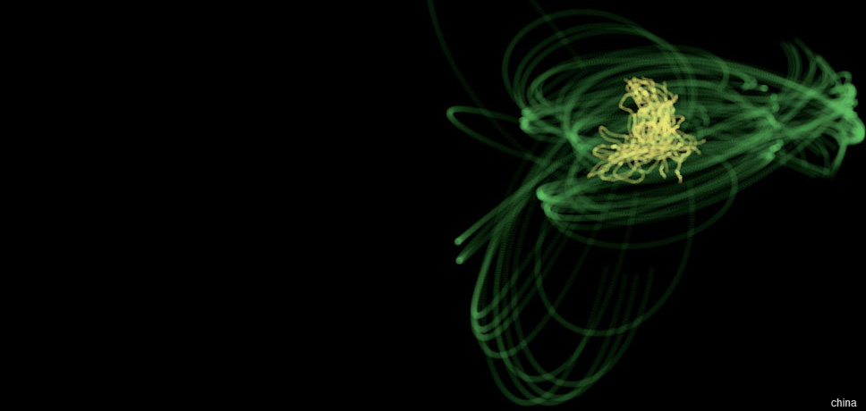
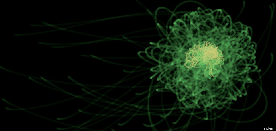
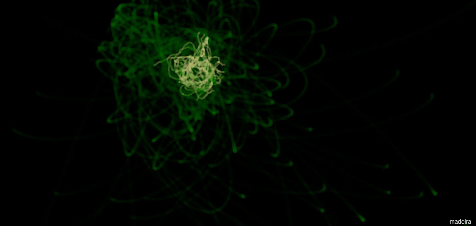
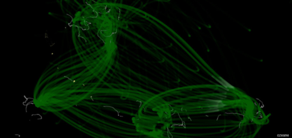
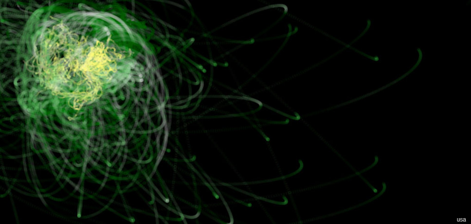
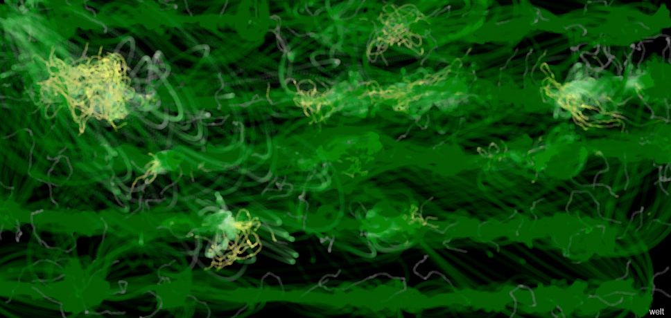
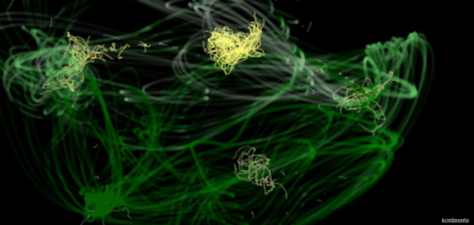
Screenshots of the results when hovering the mouse over China, India, Madeira, the oceans, the United States of America and the world (from above).