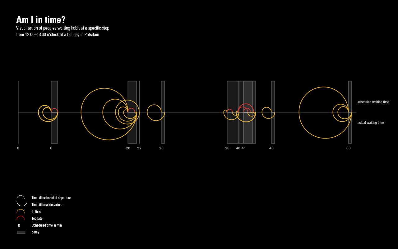
This work was a one day project with a small coding session at night where I visualized waiting habits of people on a bus station. I observed one station for one hour on a holiday in the city center of Potsdam. I noted when people arrived at the stop, what vehicle they took and - if so - the delay of that vehicle. The stop I choose is approached by busses and cable cars.
How to read the visualization
On the x-axis there is the time of 60 minutes. That's the time where I observed the stop secretly. Every time a vehicle was scheduled, there is a transparent rectangle starting on that x-value. There is also a note of the scheduled time below. The rectangle ends at the time of the actual arrival. So the width of a rectangle represents the delay. In a perfect world there would just be a vertical line.
There are some arcs around every rectangle. Every arc belongs to a pair of two that always have the same start, but not necessarily the same end. Each pair of arcs is representing one passenger. An arc that goes above the x-axis shows the scheduled waiting time and one below shows the actual waiting time. So a circle would mean someone was early, but the vehicle was just in time. The more snaily two arcs get, the longer is the delay of the vehicle.
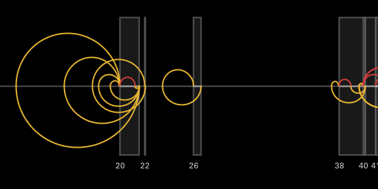
One detail that shows the basic elements.
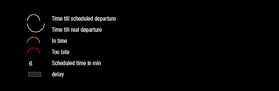
Key of how to read the visualization, you can also find on the bottom.
Data insights/h2>
Basicly you can see that there wasn't a lot of transportation in that hour. That was probably caused by the holiday. And it was also around lunch time. The amount of long waiters and short waiters is kind of even and you also can see that it's not very common for a vehicle to be in time.
There are two very big arcs. One in the first third and one at the end. So these arcs represent two people that were super early. Ergo they had to wait a long time even the vehicles would come as scheduled - which they did not. It's maybe a bit of a stereotype, but those passenger were in both cases old women.