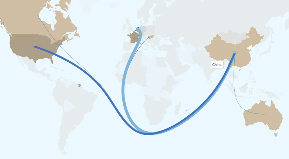
World-wide trade is massive! Huge amounts of stuff are traded around the world every day. Digging into the extensive data of FAOSTAT, we discovered that an incomprehensible amount of living animals is being traded around the world - where chicken is the animal traveling the most.
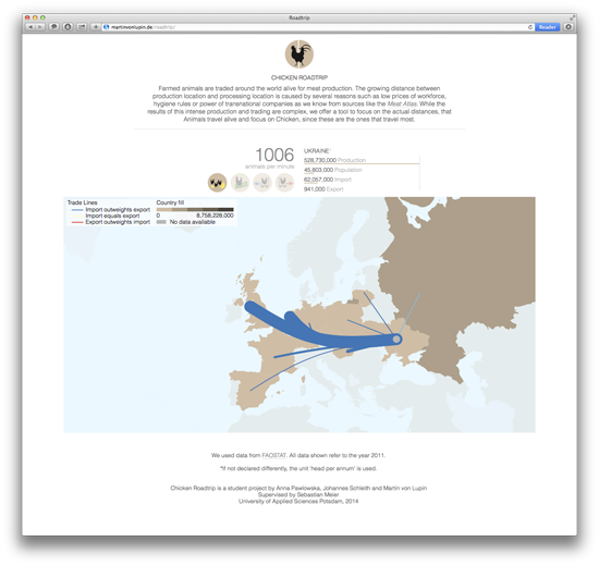
The explorable visualization was designed during summer term 2014 in a small group of three students at the University of Applied Science, Potsdam. Individual countries can be highlighted. Additional information about production and trade of the selected country is displayed above the map.This project is an online visualization of the world trade with living chickens.
What is this all about?
The visualization's main part is an interactive world map where countries can be selected. For a selected country export and import are shown via edge-bundled lines. The amount is shown by the line's thickness and the trade type is shown by color (blue: import outweigh export, red: export outweighs import, yellow: import equals export). Additional information layers like production amount or prices can be added and are displayed as a chloropleth map.
Above the map there is a second that shows an eye-catching fact for the selected information and normalized bar charts for production, population, export and import to get some more information about the trade of the selected country. To get a feeling for the tremendious amount of traded animals, the values are all set as heads and are normalized by the country's production. This only works because in mostly all countries the production (in heads) outweighs the import, export or the population (exceptions are Uzbekistan and Tajikistan).
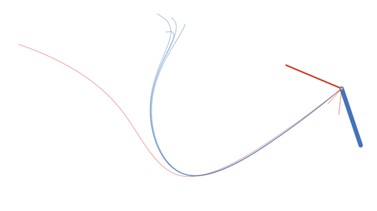
Edge-bundled lines separated from the map; example India

Eye-catching fact for the selected country and some numbers for production, population import and export. The bar charts are normalized by the country's live-chicken production.
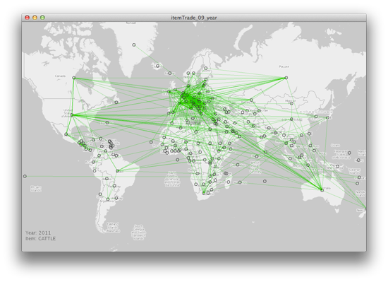
Early prototype to find an interesting trade item; made in processing with the unfolding library
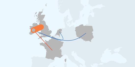
Trading live-chickens in Ireland
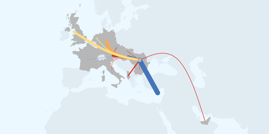
Trading live-chickens in Rumania
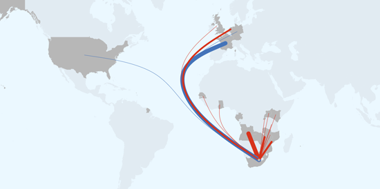
Trading live-chickens in Southafrica
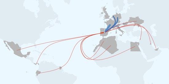
Trading live-chickens in Spain
