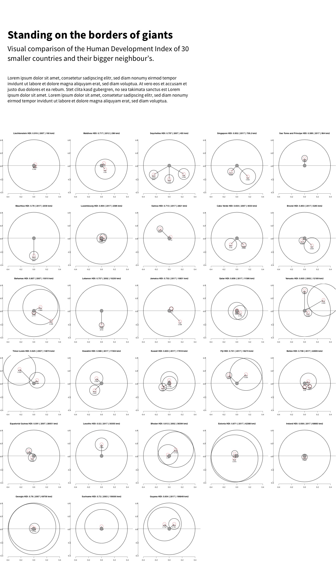
Standing on the borders of giants
A data visualisation of the Human Development Index of 30 smaller countries and their neighbours. My submission for the 2019 World Data Visualization Prize in the category Static Image following the theme "Small Countries are Beautiful."
Go to original project website
About this visualisation
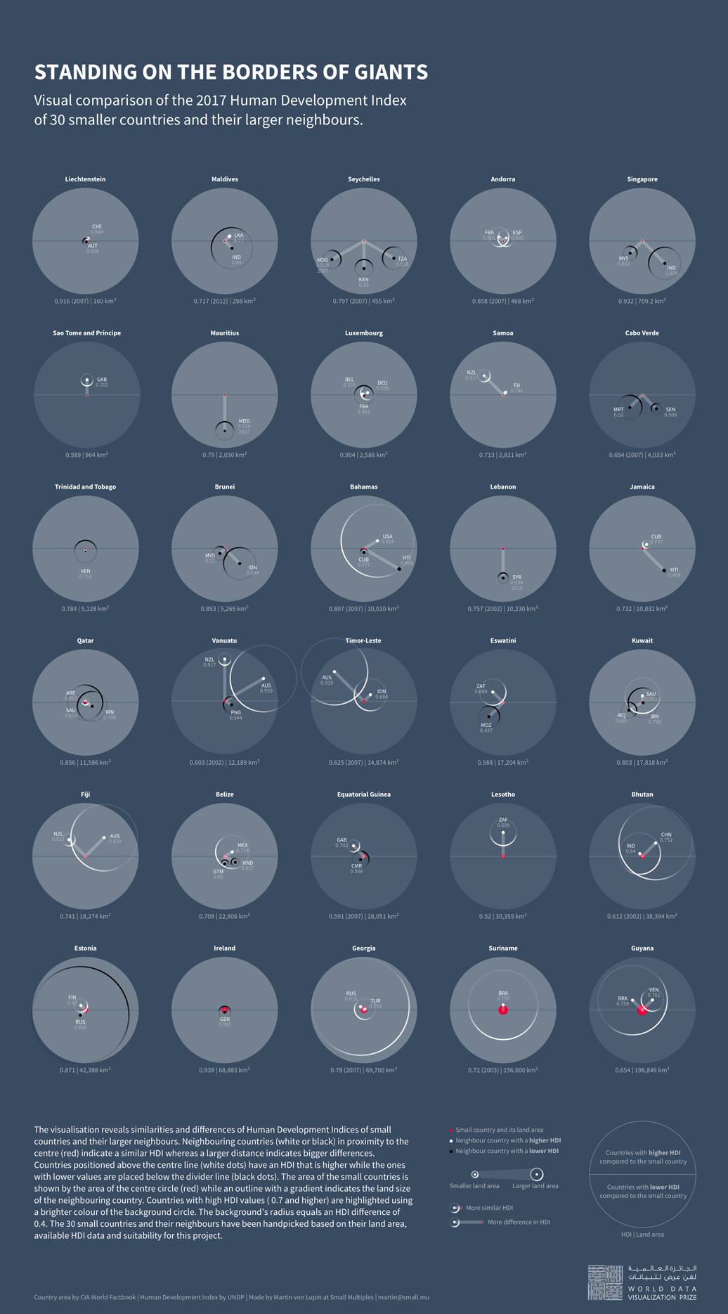
The visualisation reveals similarities and differences of Human Development Indices of small countries and their larger neighbours. Neighbouring countries (white or black) in proximity to the centre (red) indicate a similar HDI, whereas a larger distance indicates bigger differences. Countries positioned above the centre line (white dots) have an HDI that is higher, while the ones with lower values are placed below the divider line (black dots). The area of the small countries is shown by the area of the centre circle (red) while an outline with a gradient indicates the land size of the neighbouring country. Countries with high HDI values ( 0.7 and higher) are highlighted using a brighter colour of the background circle. The background’s radius equals an HDI difference of 0.4. The 30 small countries and their neighbours have been handpicked based on their land area, available HDI data and suitability for this project.
About the competition
The World Data Visualization Prize is part of the 2019 World Government Summit in United Arab Emirates and led by David McCandless and Information is Beautiful. There are three possible output types and three data themes. We chose to submit a piece in the category Static Image for the theme "Small Countries are Beautiful."
The dataset
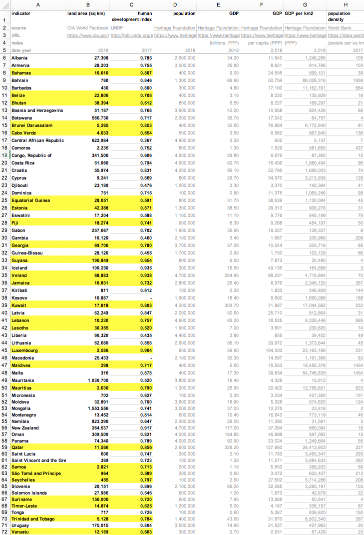
When we jumped into the dataset about small countries, we noticed that there were numerous attributes that could characterise a small country. It could be the land area, the total area including other territories, the size of the population or any of the above in the relation to the neighbouring countries. While the supplied dataset seemed to focus on the size of the population, we decided to go with land area.
When analysing the dataset we noticed that we had to apply some filtering to the 67 countries, as some are quite large and – in our eyes – don't qualify as a small country. For example, Mongolia is part of the supplied data, but it's one of the 20 biggest countries and even the second largest landlocked country in the world, with an area of 1,553,556km². On the other hand, there were some small countries we were missing. Those were Andorra, Liechtenstein, Singapore and Eswatini (Swaziland).
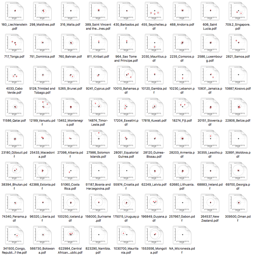
Have a look at the supplied data. The countries and data points that made it into the final poster are coloured in yellow.
Screenshot of supplied dataset about small countries
Do you want to be my neighbour?
What is a neighbour of a small country? At first glance – when looking at a country like Liechtenstein – we thought this should be easy: A small country sharing the same border with a country that is significantly larger. But then it quickly got more vague. What about countries that are not so small, but still have big neighbours; or countries who are remote islands and don't share any borders – not even maritime boundaries. In the end, we handpicked the countries using a mix of personal judgment and a set of rules:
- small country needs to have land area smaller than 200,000km²
- big neighbour must be at least two times bigger than the small country
- direct land border is preferred; maritime boundary is secondary
Some countries didn't have a 2017 HDI value; in that case the last value was used. This is indicated in the final poster. E.g. the 2016 HDI was used for Lebanon's neighbouring country Syria.
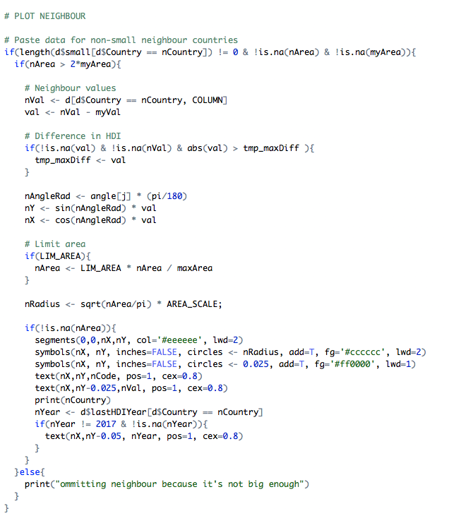
Finding the visual language using R
We did a little scribbling and a little coding and then ended up with a mapping that we felt could work. The mapping focuses on the difference in HDI and shows the land area of the small country and its neighbours for context.
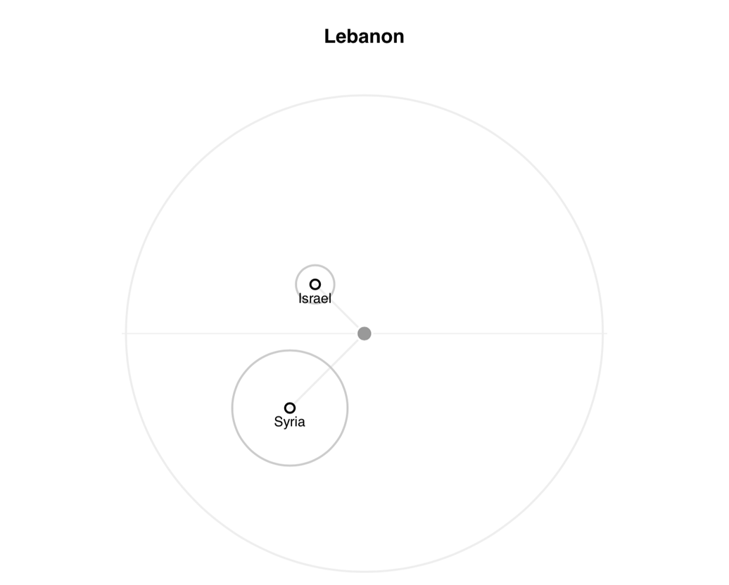
Raw prototype of visual for Lebanon showing two neighbouring countries.
Israel with higher and Syria with lower HDI.
Applying mapping to long list
Screenshot of generated PDF files for 70 countries
To see how the mapping turns out we applied it to the full set of 70 countries. We then looked at every individual result and removed the ones that didn't seem suitable; for example countries that don't conform with the rules listed above. The visualisation of each country was exported as an individual PDF, which made it easy to mark favourites, create a shortlist and eventually import to Sketch for further visual design and layout.
Testing the layout with the shortlist
We took the shortlist of 28 countries and laid them out in an arrangement that would be close to the final poster design. At this stage, we went back and forth and tweaked parameters such as angles and the maximum/minimum diameters of circles that represent the countries. Once we were happy with the results we removed redundant elements such as scales, applied a colour schema and added copy and legend.
Early stage layout in Sketch with raw graphics straight from R
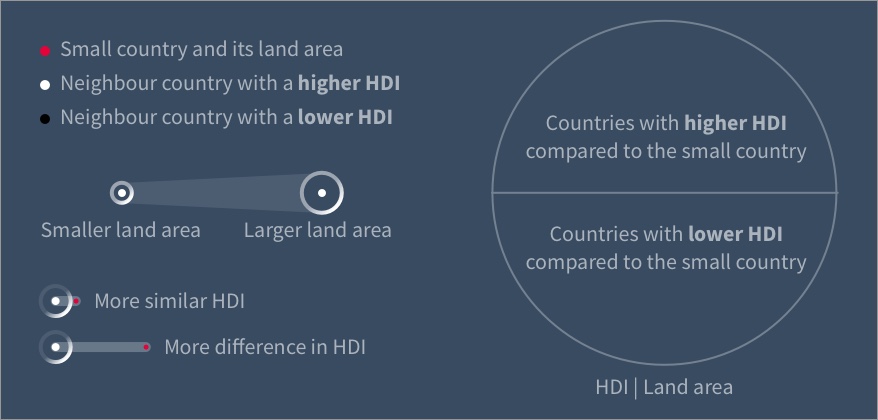
Legend with visual encoding
Final visualitation and insights
The visualisation invites the viewer to explore the relationship between proximity to large countries and differences in HDI. We find it surprising how some small countries like Luxembourg have a very similar HDI like the bigger neighbouring countries whereas others have a vastly higher (e.g. Seychelles) or lower index (e.g. Lesotho).
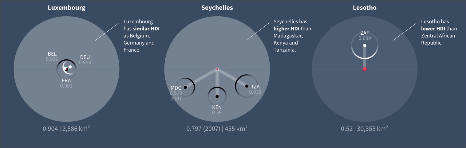
Visual comparison of Luxembourg, Seychelles and Lesotho
You can download the poster in full resolution, view the winners of the World Data Visualization Prize or see the gallery of submissions.
Impressum // © 2020 - Martin von Lupin