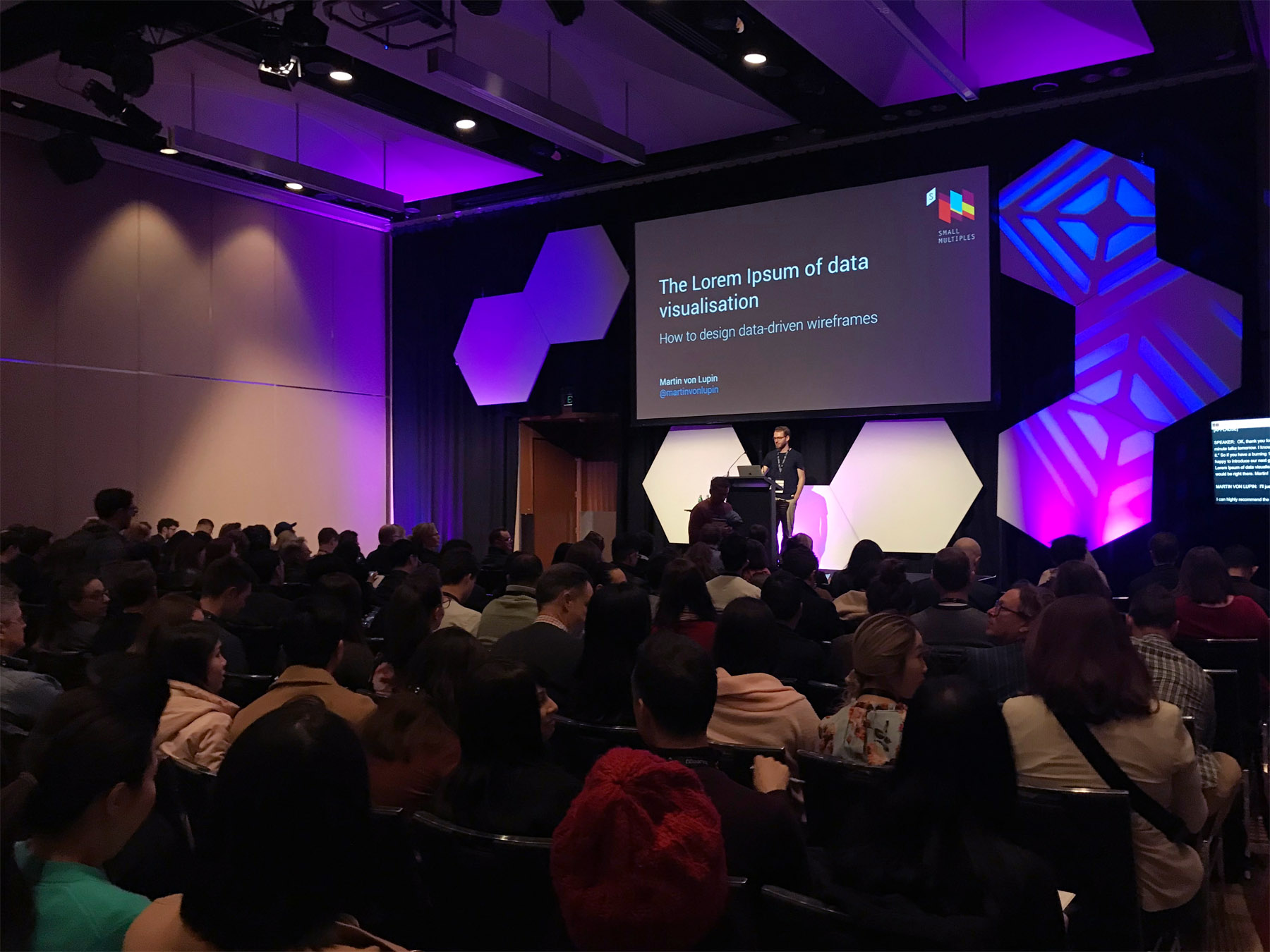
Talk at UX Australia 2019
The Lorem Ipsum of data visualisation – How to design data-driven wireframes
View presentation slides (PDF)
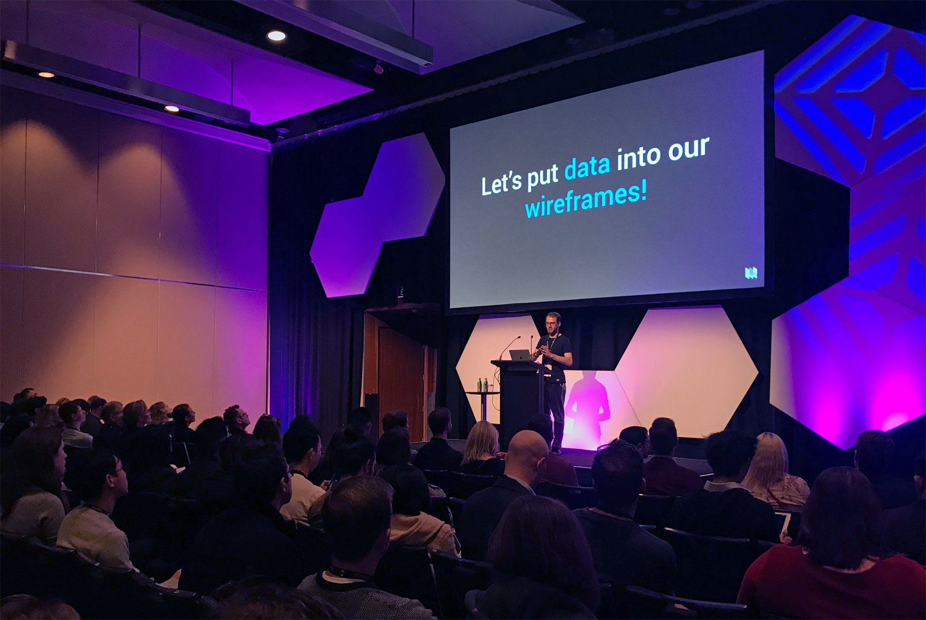
Having to put charts into wireframes can be cumbersome. If you ever had to design a dashboard or a report you might have faced challenges such as: what data to show and how to define useful metrics; how to best communicate your low level ideas with clients; what tools to use to create charts; whether to design in low or high fidelity; how to maintain a consistent visual style; or when and how to incorporate real and fake data.
There are indeed many ways to go here. Approaches include creating charts within your favourite wireframe environment; using hand drawn sketches as placeholders, importing visuals created with tools such as Excel, or building a prototype using code. It all gets more complicated when you go beyond your usual line and bar chart and enter the realm of designing for highly bespoke and interactive exploratory interfaces.
As UX designer at a data visualisation studio, Martin is constantly working with data-driven wireframes. In this presentation, he will shed light onto possible obstacles and give a variety of solutions on how to overcome them. He will bring real examples from many of the studio's projects and give insights on their creative process along with practical tips on how the design team deals with data and charts when prototyping.
Photos
Impressions from social media
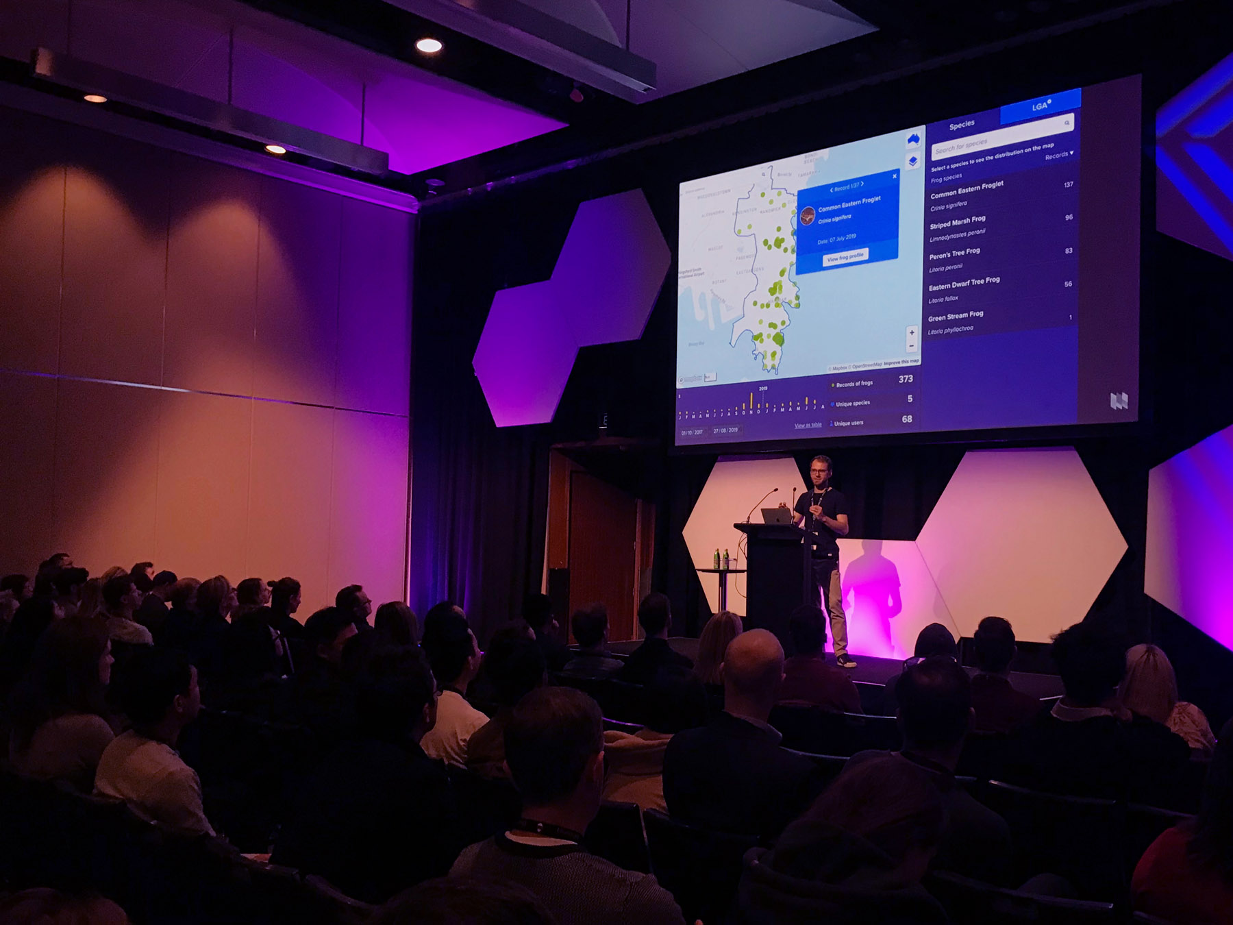
when real data adds value and benefit during the wireframe phase, use it... @martinvonlupin #UXA2019 @UXAustralia @FrogIDAus pic.twitter.com/fJW8FvGTqo
— blueegg (@blueeggtweets) August 29, 2019
@smallmultiples “The UX of data driven wireframes” #uxa19 pic.twitter.com/RetM0YubUa
— milly ✌️ (@meelijane) August 29, 2019
Love how @martinvonlupin is being candid about what didn’t work & his wrong assumptions, as well as the successful aspects of his projects #UXA2019
— Daniela Meleo (@danielameleo) August 29, 2019
Hi! please find the unroll here: Thread by @RohanIrvine: "Next up is Martin Von Lupin — The Lorem Ipsom of data visualisation: how to design data driven wireframes. […]" #UXAustralia #UXA2019 https://t.co/B1uZu0u2Gb
— Thread Reader App (@threadreaderapp) August 29, 2019
Have a good day. 🤖