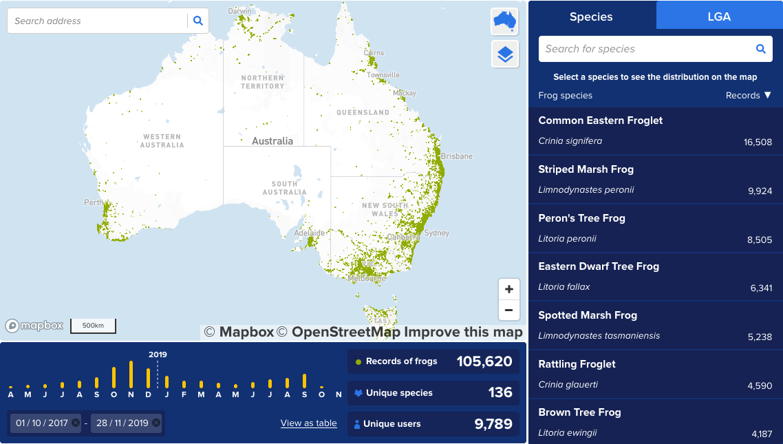
In this map, we visualise frog locations that citizen scientists have recorded using the mobile app FrogID. With the help of this app, scientist from Australian Museum are aiming to get a holistic picture about frog populations in Australia and how they change over time.
Frogs are very sensitive towards change in climate and water quality, so there is potential to find evidence that changes in population are caused by climate change.
The map
The interactive map allows users to explore frog recordings across Australia. Seamless zoom encourage the user to drill into an area of interest. Frogs can be filtered by species to indentify individual habitats. Frog recordings can be filtered by Local Government area (LGA) to explore species living in your neighbouthood. Generic recording of frogs can be played and more details about a species are available on demand.
Wireframes
I've designed the wireframes for the map visualisation. The cool thing is that the map and charts in the wireframes actually contain real data. This made testing interactions really fun and it was a big plus when presenting it to the client.
I've achieved this with our amazing Chippencharts plugin for Sketch and some QGIS magic. Check out the video below if you're keen to hear me talking about this.
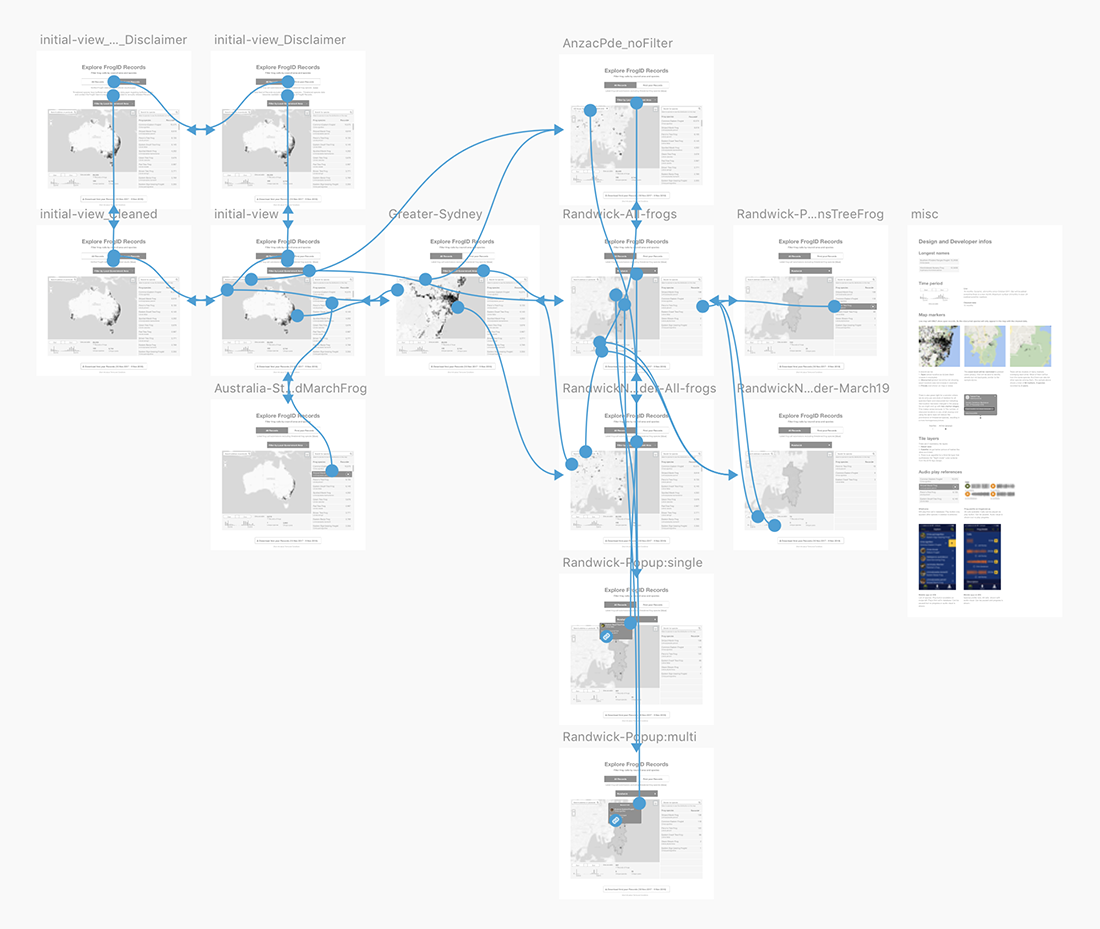
All wireframes and links for the interactive prototype.
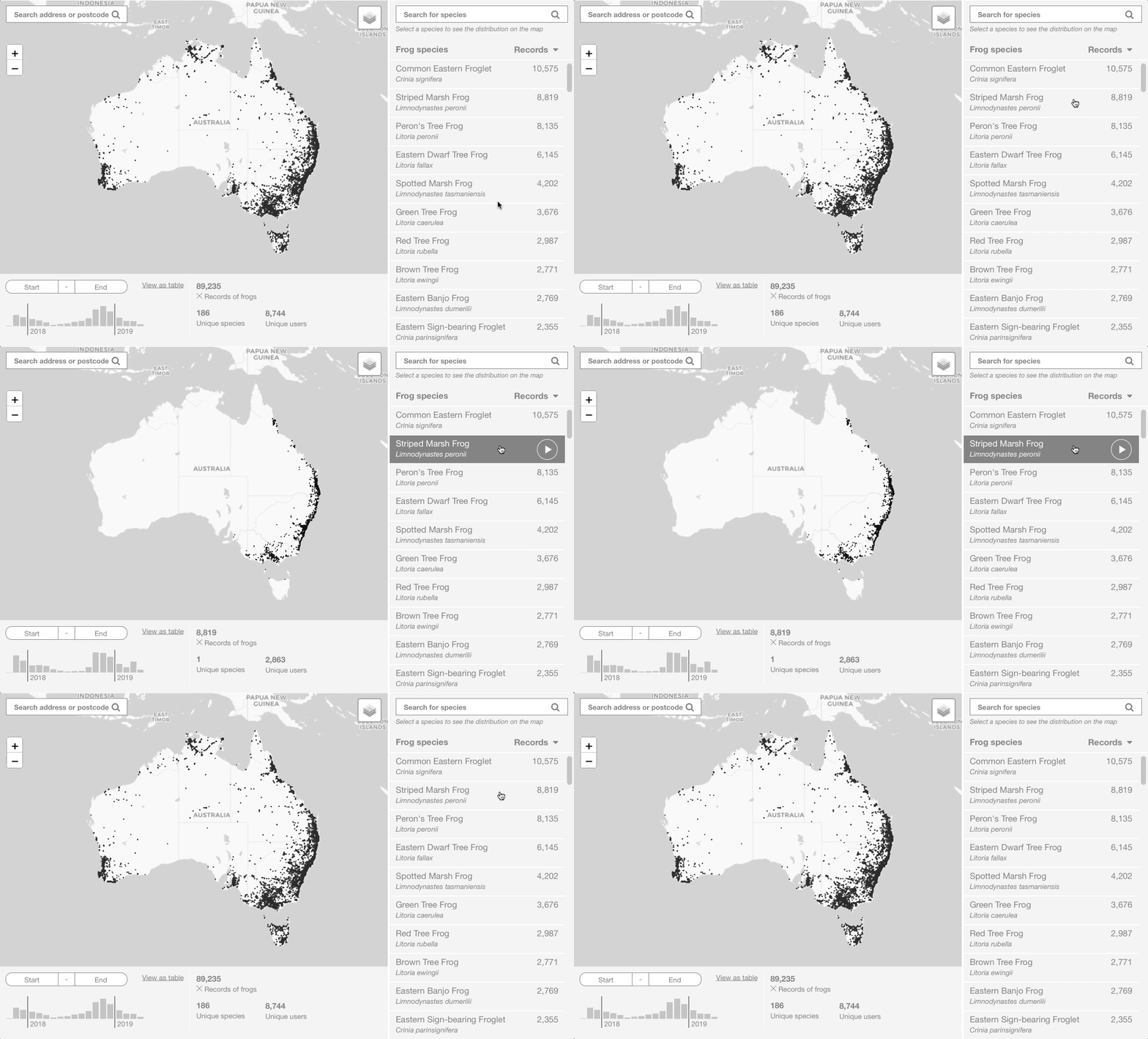
Interactive wireframe prototype showing the filtering by species. Notice how data in charts and map update accordingly.
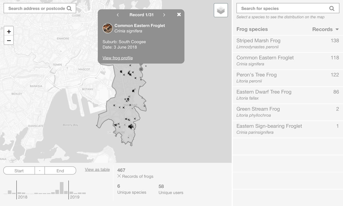
Wireframe showing filter by Local Government Area (Randwick) and a selected location with details about that frog recording. Again, all real data straight in the wires.
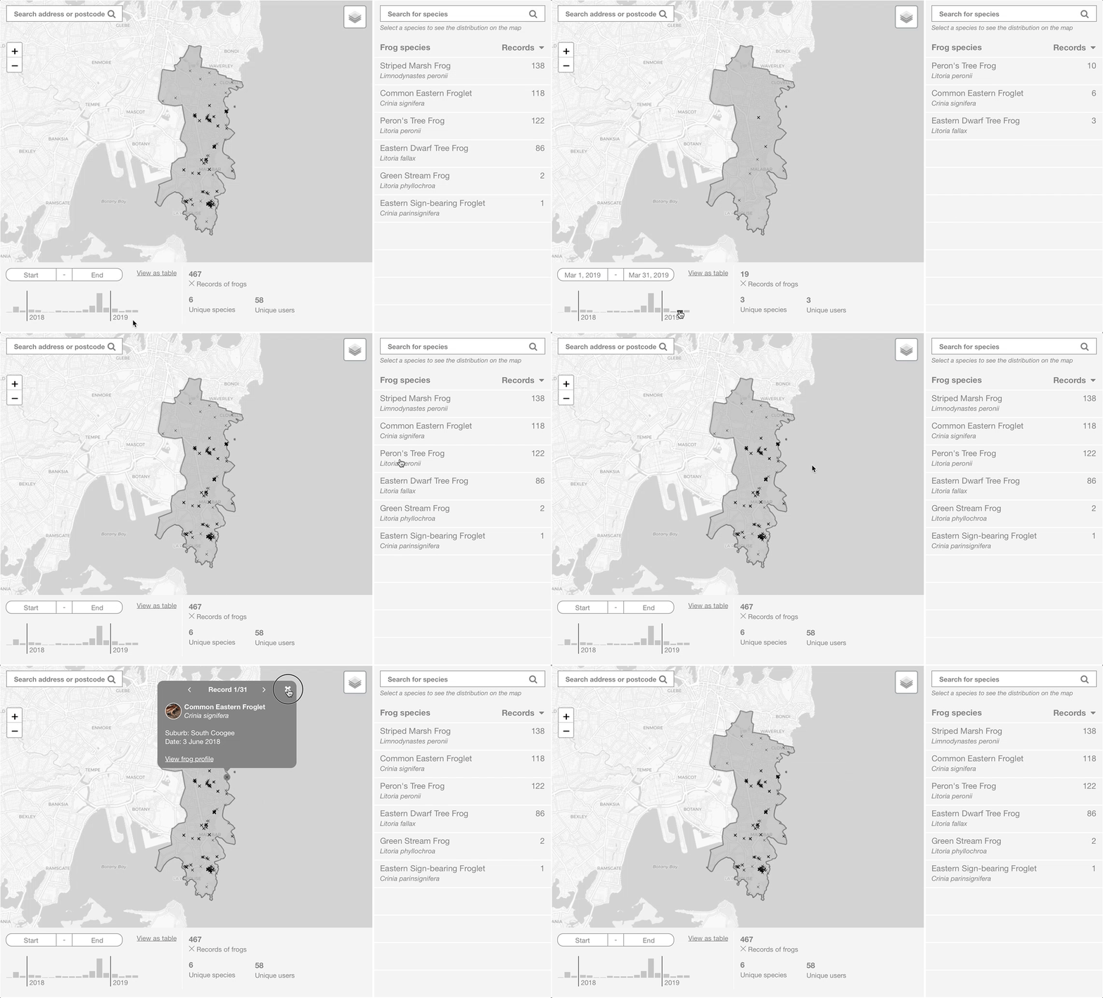
Interactive wireframe prototype showing filtering by month and by frog species on LGA level.
Final build
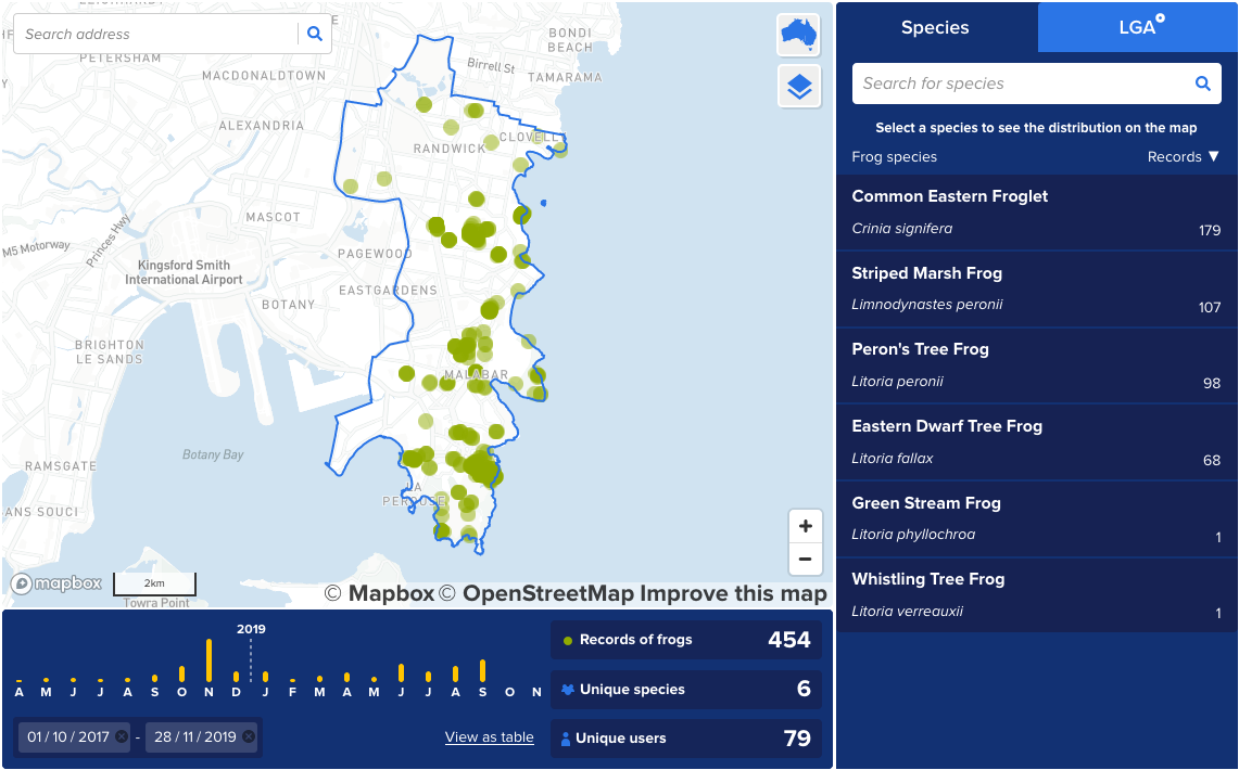
Final build is very close to wireframes. No data surprises here!
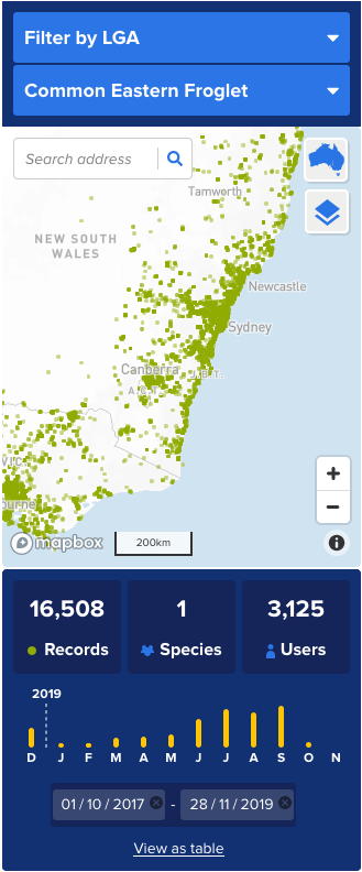
The map looks great on your mobile.
